
How to navigate the challenges of color and web accessibility
- By Siteimprove Editorial Team - Updated Nov 25, 2021 Web Accessibility
It probably comes as no surprise that color, branding, and visual elements can be quite challenging when it comes to website accessibility. It doesn’t mean it’s impossible to have a beautiful, colorful website that’s accessible, it just means there will definitely be some effort and research on your end.
There are a lot of reasons for the challenges, ranging from types of vision conditions to the difference between level AA and AAA compliance. The end goal of course is to ensure your website is inclusive for differently sighted users. Depending on brand guidelines already in place, this may be easier for some organizations than others.
But, there is hope to be successful with color and web accessibility. Let’s take a look at some of the WCAG 2.0 criteria, types of vision conditions, and how you can find out if your website is accessible with colors:
The WCAG color contrast criteria
1.4.1 Use of color
The reason for the use of color success criterion is “to ensure that all users can access information that is conveyed by color differences, that is, by the use of color where each color has a meaning assigned to it”. This applies to things such as forms, form elements, etc.
For example, if you have a form on your website and some fields are required while others are not – color cannot be the only way to differentiate required from non-required fields. If your required fields have red text or boxes in red, then there should also be alternative text that says “required” so those who cannot see red know it is a required field.
1.4.3 Contrast (Minimum) – Color contrast
To meet AA requirements for color contrast, the foreground and background colors need to have a 4.5:1 contrast ratio.
According to WCAG guidelines, the contrast ratio of 3:1 is the minimum level recommended for standard text and vision, while “the 4.5:1 is used in this provision to account for the loss in contrast that results from moderately low visual acuity, congenital or acquired color deficiencies, or the loss of contrast sensitivity that typically accompanies aging.”
1.4.6 Contrast (Enhanced)
In order to achieve level AAA for color contrast, you would need to enhance your contrast on the foreground and background with a ratio of 7:1. Essentially, this equates to black text on a white background with some color options, including high-contrast levels of blue, red, and purple.
Branding and accessibility
This may be the biggest challenge you run into with color and digital accessibility. Whether you’ve been at your organization for more than 10 years or just started, there was likely a brand style guide in place. And if there was a brand style guide in place, it’s likely that color contrast and accessibility were not a consideration.
What to do?
First, start by working with multimedia managers, graphic designers, and others on your team to evaluate the colors on your website. You could split up different web pages and test against guidelines by using a free color contrast checking tool, such as the Snook Color Contrast Check (there are many other free extensions out there as well), and see how well your brand is holding up against the guidelines.
For any pages that don’t check out, approach your manager and other brand stakeholders in the company with your results. It’s possible to tweak brand colors slightly to make them accessible online.
If people within your organization disagree with tweaking brand colors, just make your case stronger. Create a preview blog post or a graphic using slightly different colors that pass the WCAG 2.0 color contrast test and present this to brand stakeholders. This might be the easiest way to demonstrate that slight color changes won’t affect the branding overall.
And let’s be honest about something – branding is one of those sticky subjects at all organizations. There’s always someone who is attached to the name, the logo, the colors. So approach with caution, but also be your organization’s accessibility advocate. The same people who might push back are the ones who will be thanking you in a few years when web accessibility guidelines are even more important (remember there is a cost associated with waiting to implement accessibility practices).
Also, in 2010, 524 million people were age 65 or older, equaling 8% of the world's population. By 2050, the number is predicted to triple to 1.5 billion, representing 16% of the world's population. Between being accessible for your web visitors now and thinking about the future of your audience, maintaining an accessible website is important.
Vision conditions to consider
The other consideration with color, branding, and web accessibility is to think about the various vision conditions that affect people who may be interacting with your website.
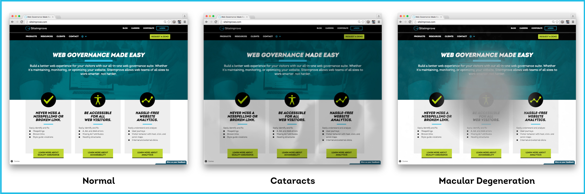
- Macular degeneration: Age-related macular degeneration is a condition that involves the loss of the person’s central field of vision. Globally, AMD ranks third as a cause of blindness. People with macular degeneration will have a blurred/cloudy view centrally on your web pages.
- Diabetic retinopathy: In people with diabetes, this condition affects blood vessels in the light-sensitive tissue and is the most common cause of vision loss among people with diabetes. People with diabetic retinopathy will see large spots and slightly blurred text on your web pages.
- Cataracts: Cataracts clouds the lens of the eye. Adults with diabetes are two to five times more likely to develop cataract than those without diabetes. Depending on the severity, someone with cataracts will have see a slightly clouded view of your website or a very clouded view.
- Retinitis pigmentosa: a group of inherited diseases causing retinal degeneration.
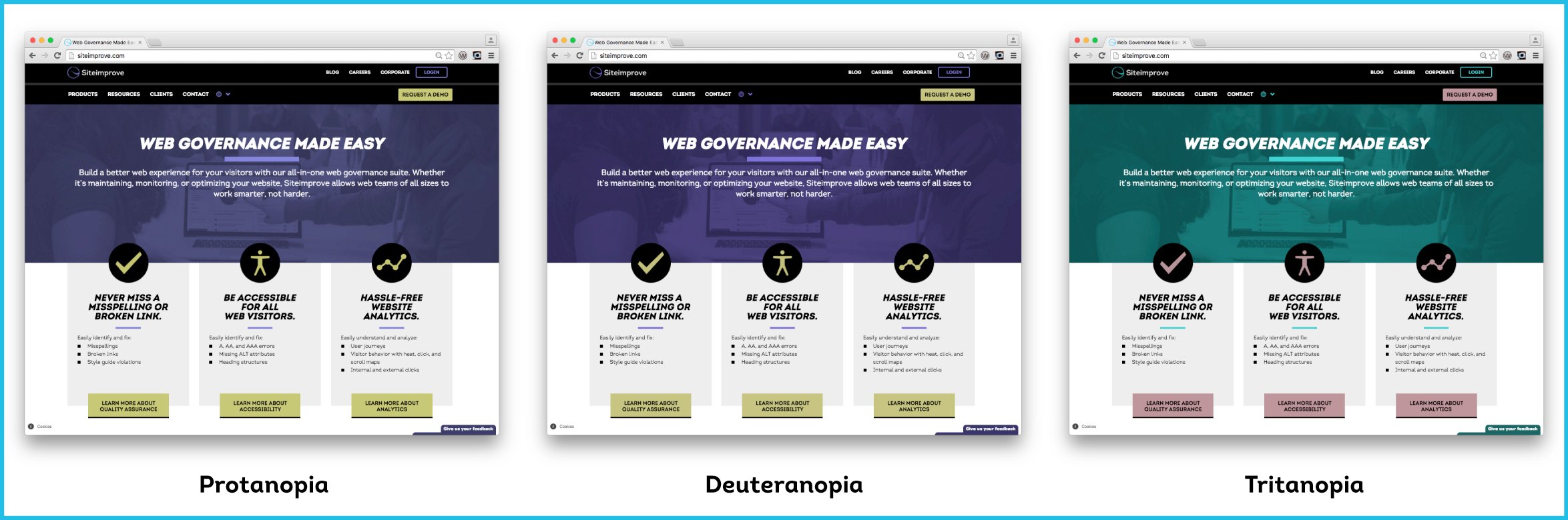
- Deuteranopia: This is a condition where people are less sensitive to green light. If you use red on your website, a person with deuteranopia will see reds darker than normal.
- Protanopia: This is a condition where people are less sensitive to red light. The affect is similar to deuteranopia but red will look even darker to someone with protanopia.
- Tritanopia: This is a reduced sensitivity to blue light, but not very common. If you use green or blue on your website, someone with tritanopia will have a hard time distinguishing between the two. If you use yellow, they may not see it or see a light shade of red instead.
- Achromatopsia: People with this condition cannot see color at all, but it is not very common. For people with achromatopsia, their world is black, white, and shades of gray. They will not be able to distinguish color on your website.
Why does it matter to consider all of these issues? Because it gives you perspective on the types of challenges people encounter when interacting on your website. According to the World Health Organization, there are 285 million people around the world who have some type of visual impairment, with 39 million being blind. That’s a lot of people, and you want to ensure that everyone, regardless of vision condition or disability, can access your website’s information.
Color contrast accessibility tools
Want to know if your website, branding, and digital colors are living up to the WCAG guidelines? Check out many of these great resources that can help you test colors on your website (some are Google Chrome extensions):
Ready to create more accessible and inclusive web content?
Siteimprove Accessibility can help you create an inclusive digital presence for all.
Request a demo