
Your website's visual elements tell customers who you are before they read a single word. But what happens when your brand colors shift between pages, your logo appears in different sizes, and your typography switches styles across channels?
Every inconsistency chips away at customer trust and brand recognition.
Think about it: Your landing pages use one shade of blue, your blog another, and your checkout page . . . well, it's somehow using both (plus a few more). Needless to say, this is a bad look from an aesthetic point of view, and that messiness can cost conversions and credibility.
The traditional solution (periodic manual design reviews) can't keep up with the expansive nature of many companies’ digital estates, nor the breakneck pace at which they publish. Even meticulous brand guidelines falter without automated verification when your brand spans multiple websites, platforms, and campaigns. Human reviewers catch obvious mistakes but miss subtle visual drift that gradually weakens your brand's impact.
When manual design reviews fail, AI can fill the gap, as many brand experts at many top companies will tell you. Indeed, many automate visual consistency checks to eliminate grand drift and maintain perfect visual alignment across their entire digital presence, all without slowing down content creation.
What is visual consistency?
Visual consistency means using exact color codes, typography, and design patterns to help customers recognize your brand consistency instantly across every touchpoint.
Think Netflix: You spot their page immediately — that signature red (#E50914), that custom font, those perfectly arranged images. Like spotting your favorite brand's packaging on a crowded shelf, you register it in a moment.
Done right, your visual elements (colors, fonts, spacing, buttons, images) guide customers naturally through your content. When every piece fits together, customers trust your brand and don’t lose sight of what brought them to your site in the first place.
The psychology behind visual consistency
Your brain processes images instantly. You recognize a stop sign before reading "STOP" and spot friends before seeing their faces clearly. The same happens with brand visuals. When customers see consistent patterns across your website, they navigate intuitively without conscious effort.
Think about reading a book: You don't notice fonts or layouts because they stay consistent. But if each chapter looked different, you'd waste energy adjusting instead of reading. Websites work the same way. Consistent visuals let customers focus on their tasks instead of relearning where they are, whether that’s on your site or while reading a one-pager.
This familiarity builds trust. Consistent design shows reliability and attention to detail, while inconsistencies create doubt. When buttons, colors, or layouts shift unexpectedly, customers question whether they're in the right place. Visual consistency is a signal to customers: “Yes, you’re in the right place. We’ve got what you need.”
Five visual elements your brand can't ignore
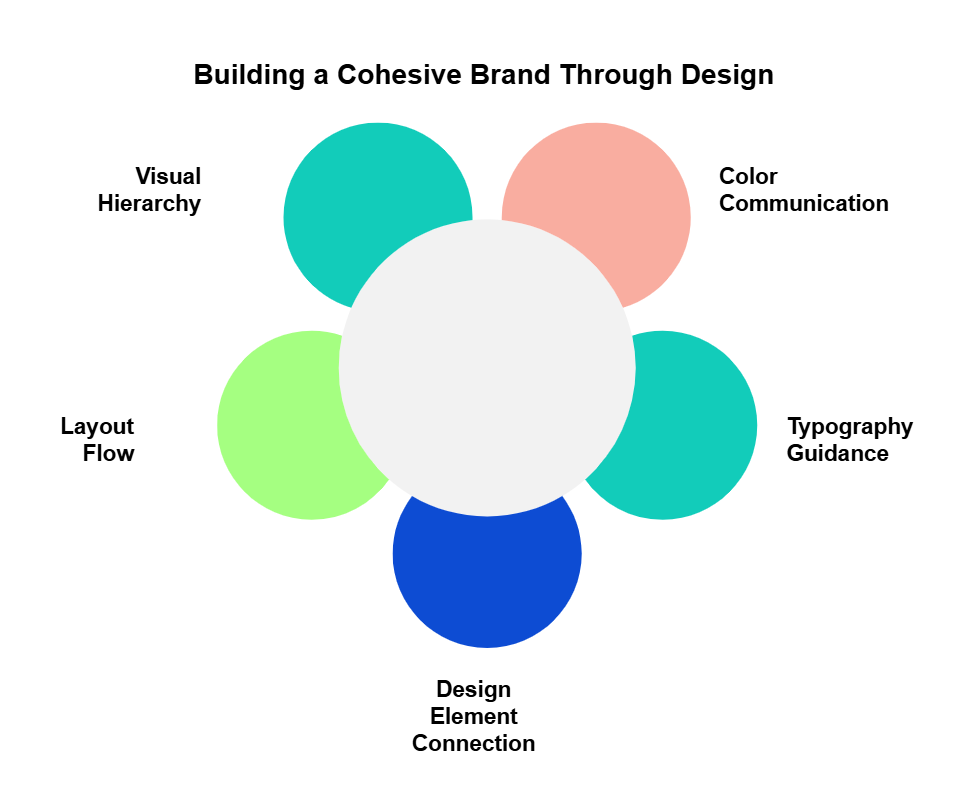
Strong visual identity isn't built on good design choices alone; it's built on consistent design choice). Five key elements underpin a cohesive brand presence, no matter the platform.
Color that communicates
Your color palette does more than look pretty; consistent colors tell customers where to click, what to read first, and when they've found important information. But this only works when every team uses the same color codes. That teal button on your homepage should match the teal in your help documents, pixel-for-pixel.
Typography that guides
Font choices create clear hierarchies that guide readers through your content. Your H1 headings should command attention, while body text stays crisp and readable. When these type styles stay consistent, customers instinctively know what's most important on every page.
Design elements that connect
Every visual element, from your logo to your smallest icon, should feel like part of the same family. Think about how Apple's product icons share the same rounded corners and clean lines, or how Nike's photography maintains the same dynamic energy across campaigns. This consistency in design elements creates instant recognition.
Layouts that flow
Your web design should follow consistent grid patterns and spacing rules. When your homepage, product pages, and blog all share the same underlying structure, customers navigate intuitively. They know where to find menus, how content sections will flow, and where important buttons will appear.
Visual hierarchy that works
Strong visual hierarchy means arranging elements so customers naturally focus on what matters most. Sure, want to make important things bigger, but you also want to create consistent size relationships, spacing, and contrast to create clear paths through your content. When this hierarchy stays consistent across pages, customers never feel lost.
Relying on your eyes to check for visual accuracy means room for errors.
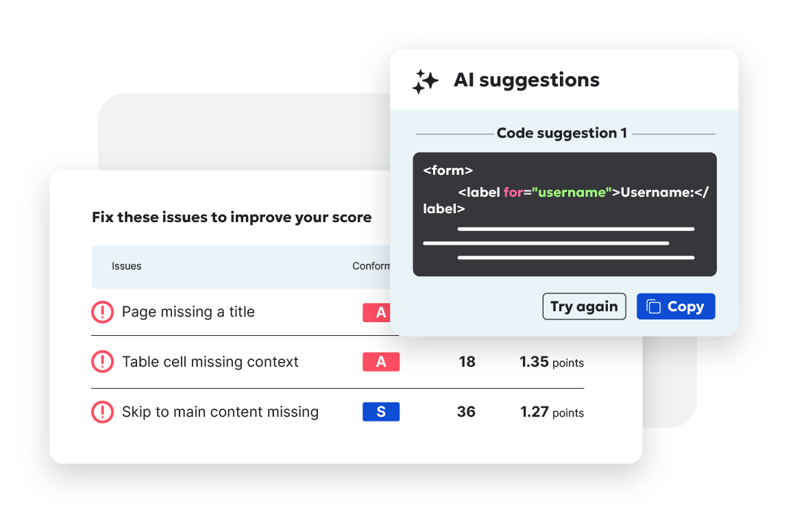
Siteimprove’s Brand Consistency helps teams by automatically checking every page for exact color codes, font usage, and approved design elements. When something doesn't match your standards, like a button using the wrong shade of teal, you get an immediate alert.

How to build a cohesive visual identity system
A visual identity system, rather than a style guide that sits unopened in a random file, should guide design decisions. Here's how to create guidelines your team will reference daily.
Start with a design system
A design system goes beyond listing style rules to function as a complete visual playbook: Reusable components, pattern collections, and practical examples show how to maintain a cohesive brand identity across every channel.
Consider your website's navigation menu. Each element (buttons, dropdowns, search bars) must work individually while creating a seamless user experience. Your design system ensures every team builds these elements consistently, whether they're creating landing pages, product features, or help documentation.
Let's say your marketing team needs to create 20 landing pages for a new product launch. With a proper design system, they don't start from scratch each time. Instead, they access pre-built, brand-approved components: hero sections, feature blocks, testimonial cards, and CTAs. They can focus on crafting compelling content because the visual consistency is built into the components they're using.
Connect visuals to message
Your visual elements should reinforce what your brand stands for. Here's how this works in practice:
- Color choices: If you're a fintech company, you might use deep blue (also known as “corporate blue”) to signal trustworthiness and small touches of bright green to signal growth and innovation.
- Typography pairing: Your headlines use a modern sans-serif to signal innovation, while body text uses a traditional serif for readability and credibility.
- Button styling: Important actions like "Start Free Trial" maintain consistent prominence and positioning across every page.
- Form design: Fields use structured layouts and clear spacing to make users feel secure sharing their information.
Take a company like Apple. Its website commands attention across every screen. Full-bleed images stretch edge-to-edge, while subtle animations respond to each scroll and click. The interface mirrors its core belief in clean, purposeful design. When you visit apple.com, you experience the same elegance that’s built into its devices.
Balance rules with reality
Different channels need different approaches while maintaining core brand elements:
- Website vs. mobile app: Your app simplifies navigation but keeps brand colors and typography.
- Marketing site vs. help center: Documentation uses a narrower content width and larger text but maintains your visual language.
- Social graphics vs. white papers: Professional documents use a more structured layout while keeping your color palette and logo rules.
- Email vs. web: Emails adapt layouts for inbox viewing while using consistent CTAs and imagery styles.
Consider how your pricing page might adapt across platforms. On desktop, it displays a full feature comparison table. On mobile, it collapses into swipeable cards. In email, it becomes a focused summary with key points.
Each version serves its context while maintaining your visual identity through consistent colors, typography, and spacing.
Keep it current with tools
Today’s tools help maintain consistency automatically:
- Component updates: Change a button style once, it updates across all pages using that component.
- Color management: Adjust primary brand colors in one place; all instances update automatically.
- Asset distribution: Teams access the latest logos and graphics from a central library.
- Compliance checks: Automated scans flag outdated elements or incorrect usage.
Many teams are now using Siteimprove’s Brand Consistency to automate these checks. It monitors your entire website for visual compliance, alerting you when elements don't match your brand standards., like an outdated logo, incorrect font, or unauthorized color variation. The tool catches brand inconsistencies before they spread across your digital spaces.
For example, when your brand team updates the primary CTA style from rounded corners to a new pill shape, this change shouldn't require manually updating hundreds of buttons.
Your design system pushes the update everywhere that component appears, while automated checks catch any instances that need attention. The result is visual consistency at scale without bogging teams down with manual updates.
Create visual consistency across digital touchpoints
Your brand exists everywhere your customers find you. Each platform presents unique design challenges, but visual consistency needs to remain intact across every touchpoint.
Website foundations
Your website sets the standard for your visual identity. In practice, consistency includes:
- Navigation patterns: Main menu structure and behavior stays predictable across sections
- Content layouts: Similar information uses consistent formatting (like how all product pages follow the same structure).
- Component styling: Buttons, forms, and cards maintain their look throughout the site.
- Loading states: Even temporary elements like progress bars and tooltips follow brand patterns.
Consider how HubSpot maintains visual consistency. Whether in their CRM, marketing hub, or help center, you instantly know you're using a HubSpot product. The experience feels connected without being identical.
For example, here’s its help center:
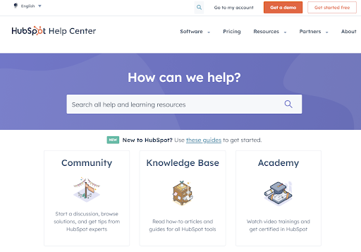
Source: HubSpot help center
And here’s its blog:
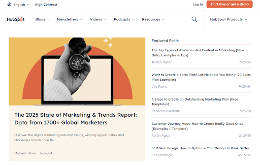
Source: HubSpot Blog
Both maintain the same font and HubSpot’s signature orange, including in the CTA buttons in the upper right.
Social media presence
Each social platform has its own visual requirements, but your brand should remain recognizable. Smart teams:
- Maintain color harmony: Profile images, cover photos, and post graphics share a consistent palette.
- Use consistent filters: Photo treatments stay on-brand across Instagram, LinkedIn, and Twitter.
- Keep logo placement: Brand markers appear in the same position across visual content.
- Scale appropriately: Graphics adapt to each platform's dimensions without losing impact.
Mobile and responsive elements
Your visual content needs to work at every screen size. A responsive design approach means:
- Email layouts that display properly across desktop and mobile clients
- Navigation that adapts smoothly between devices
- Images that scale without losing quality
- Typography that remains readable at all sizes
A restaurant chain's mobile app might simplify its menu layout compared to its website, but it maintains the same visual language through consistent colors, fonts, and image styling.
Customers know where they are because they see the same colors, layouts, and design patterns whether they're on the website, mobile app, or email. Even when layouts adapt for different screens, the familiar visuals help them navigate confidently.
Case study: How we rebranded ourselves
You know those companies that tell others how to do things but never follow their own advice? Not us. When we needed to sharpen our brand in 2024, we put our platform through its paces, using our own tools to improve our identity.
Good wasn’t good enough
Our message wasn't landing with the impact we wanted, even though we had a solid foundation. As experts in digital experience and brand governance, we set ourselves a challenge: Complete a full brand refresh in just six months using our platform.
Here's how we built better visual consistency:
- Bold color choices: Ditched the safe "corporate blue" for an electric lime green paired with neutrals — a combo that grabs attention and reinforces our innovation focus
- Design system in action: Used our platform to unify marketing assets, web components, and brand elements across every touchpoint
- Custom iconography: Created icons inspired by our platform's interface elements, replacing generic industry standards
- Accessibility from day one: Used our tools to test designs with customers and accessibility experts for universal usability
Did it work? See for yourself:
- 39.7 percent increase in search visibility
- 19.5 percent boost in organic traffic
- 13. 5 percent jump in conversion rates
Why did this rebrand hit the mark? Because we followed our own playbook: systematic visual consistency across every touchpoint. From automated checks to real-time monitoring, we used the same tools we offer our customers to keep our brand aligned across all channels.
The takeaway? You get measurable business results when you treat visual elements as core brand assets (not just pretty decorations).
Implementation challenges (and how to solve them)
Your marketing team needs to launch five landing pages by Friday. Design is updating the product interface. Development is mid-migration. Everyone's working hard . . . but not necessarily in sync. Here's how to fix that.
Get teams on the same page
When teams work separately, inconsistencies multiply. Our UX design process tackles this head-on with a centralized system where:
- Marketing accesses pre-tested components
- Design maintains quality standards
- Development gets clean, consistent code
- Everyone saves hours of revision time
Prepare to handle rapid growth
Your design system needs to grow with your company. Here's what works:
- Start with your most-used components, like buttons and forms
- Write clear documentation, complete with examples
- Test patterns across different use cases
- Set up automated checks for common issues
Fix legacy issues
Those old pages won't update themselves. Here's a practical approach:
- Check analytics to identify high-traffic pages
- List specific issues per page
- Update templates first to prevent new problems
- Run automated checks for common issues
Make UI design work consistently
Your interface needs to work the same way everywhere. This means:
- Buttons respond identically across pages
- Navigation stays where users expect it
- Forms collect information in a standard format
- Error messages provide clear next steps
Success comes from building these standards into your daily workflow. Maintaining consistency is automatic when design, development, and content teams share specific guidelines.
Best practices for lasting visual consistency
Getting visual consistency right takes work. Staying on course over time takes smart systems and regular attention. Here's what successful teams do to maintain their design elements and improve results.
Measure impact, not just intention
Set up practical ways to check if your visual consistency efforts work.
Time-to-launch metrics show whether your design system helps or hinders. Track how long it takes teams to build new pages using your components versus starting from scratch. Compare error rates between pages built with and without your system.
Usage data reveals gaps in your tools. Which components get used most? Which ones sit unused? When teams create new versions of existing components, ask why — you'll often find missing use cases or unclear guidelines.
Customer feedback provides the clearest picture. Use:
- Heatmaps to see if people find important elements consistently
- A/B tests comparing conversion rates between consistent and inconsistent pages
- User recordings to spot where design inconsistencies cause confusion
- Regular surveys asking customers to identify your brand among competitors
Set benchmarks that matter:
- Percentage of pages using approved components
- Number of brand guideline violations per month
- Time spent fixing inconsistencies versus building new features
- Customer recognition scores over time
When numbers show problems, dig deeper. Talk to teams about why they skip certain components. Watch how customers use your site. Don’t make perfection your immediate goal. Instead, focus on building a visual system that helps rather than hinders.
Automate what you can
Let tools handle the routine checks while your team focuses on creative solutions. Advanced platforms scan for off-brand colors, test component consistency, and track design asset versions. Regular accessibility checks and usage monitoring catch issues before they spread. This automation frees up time for solving real design challenges.
Document your decisions
When teams forget why certain choices were made, visual consistency drifts. To prevent that:
- Keep clear records that explain the reasoning behind design updates.
- Note which A/B tests shaped your decisions and how accessibility requirements influenced each choice.
- Write down why certain platforms need different approaches and provide specific guidelines for every component.
For example: Document why you picked that shade of blue for CTAs, share the testing data that proved its effectiveness, and explain how it meets contrast requirements. Six months later, when someone questions the choice, you'll have clear answers ready.
Build your own confidence in your brand
Your visual brand creates instant recognition across every digital touchpoint. When your design elements stay consistent, customers trust your brand more, navigate your content faster, and convert at higher rates.
Siteimprove’s Brand Consistency catches visual inconsistencies before they spread, so your brand stays aligned without slowing down content creation.
Clear guidelines plus automated validation turn manual brand reviews into an efficient system that checks every page against your standards before publication.
Reduce manual reviews with AI validation.
Siteimprove Brand Consistency helps ensure consistent, on-brand messaging that engages customers and boosts loyalty.
Request a demo