Marketers in Progress: How we’re building accessibility into our content practice
- By Ava Cramp - Jun 12, 2023 Web Accessibility
I’ll be honest.
Until I started at Siteimprove, my knowledge of digital accessibility was, quite literally, zilch.
I assumed that as a writer, accessibility was not my responsibility—and that the obligation to make content accessible fell to someone else. And I wasn’t the only one starting out in the dark. Even our Senior Web Developer admits to having next to no accessibility knowledge before he began at Siteimprove in 2017.
But we don't call this blog series Marketers in Progress for nothing.
Since I started my Siteimprove journey, I can confidently say I know heaps more about accessibility than I did on day one. I know how to craft alt text, descriptive transcripts, logical heading structures, and more. I know to turn to our tool, our experts, and our resources when I'm unsure about something.
Accessibility is a practice, and I'm getting better at it with every piece of content I produce. And I'm doing it with the help of the trusty Siteimprove platform.
A more accessible content practice
Let's be realistic, here. I recognize we're fortunate at Siteimprove to have accessibility at the core of what we do. Our employees are inspired and motivated by it, our product is built to provide it, and we hire experts to make sure we're properly honoring it.
Not every organization has that—and we see our privilege.
But even without accessibility experts at the water cooler, there's a lot that organizations can do to weave accessibility into the fabric of their business.
We want to share how we use Siteimprove and accessible practices in our content process so you can see firsthand what's worked for us (and steal it for yourself).
Accessibility is a marathon, not a sprint
No one becomes an accessibility expert overnight. But by understanding that accessibility education is a continuous process that can be broken down into manageable pieces, the idea of becoming an accessibility wizard is not so far-fetched.
At Siteimprove, it all begins in our onboarding process. The first few days as a Siteimprove employee are jam-packed with educational videos on implementing inclusivity to make sure we get off on the right foot. As content writers, we also learn about alt text, heading structure, and more. This is a great way to ensure every new hire comes in with a solid accessibility foundation.
This initial accessibility education is a great start, but it's only a drop in the bucket. We keep the train chugging along by taking it upon ourselves to learn more. But that’s possible because we’re given every accessibility resource we could hope for—you just have to know where to look.
As a contributor to the Siteimprove blog, I want to make sure my posts are 100% accurate and up to date, which involves research in its own right. But simply reading the blog can serve as a helpful tool for more accessible practices.
The Siteimprove accessibility team regularly shares valid and helpful resources that help us continue to implement accessibility into our work. Our writers might consult the writing tips provided by the Web Accessibility Initiative, and designers can validate their aesthetic choices by checking them against this accessible design handbook, just to name a few.
Our learning and education platform, Frontier, while designed to help our customers engage in courses, certifications, seminars, and more—also helps Siteimprove employees like me stay hip to the latest and greatest in accessibility and beyond. If you want to see it in action, feel free to check out our complimentary Frontier courses, available to everyone.
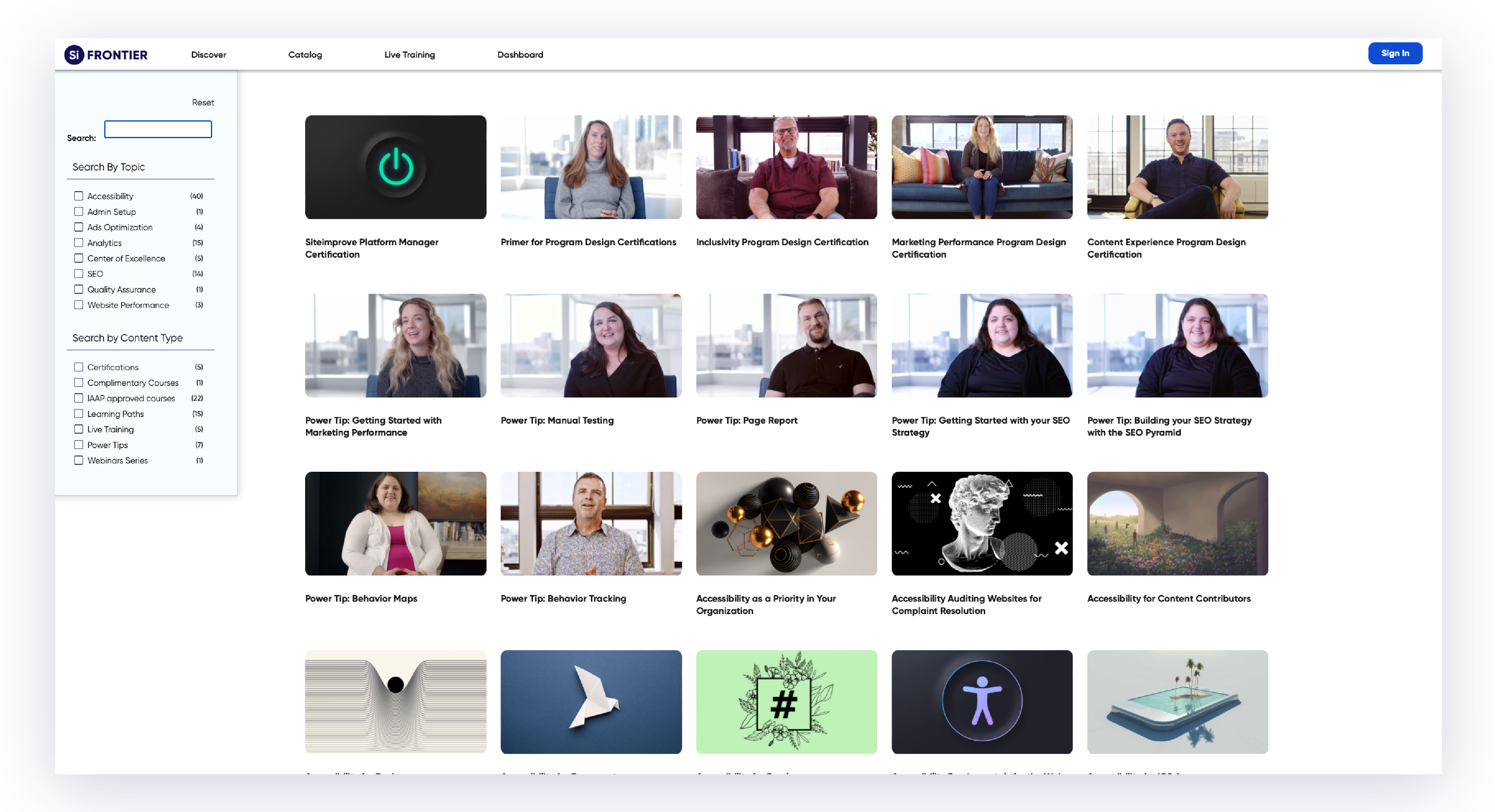
With every employee armed with at least a basic level of accessibility knowledge, it’s more likely that best practices will be understood and followed. Plus, it means the responsibility for accessibility doesn’t fall on just one or a few people, but is shared by everyone.
The buck doesn’t stop here
Assigning roles and tasks to different teams help us lighten the workload and make it clearer who’s responsible for what. In our workflow, if we spot an issue, we can flag it in the Siteimprove platform and tag the necessary stakeholder (if it isn’t you) to go in and resolve the problem.
We also implemented regular checks within our own department. Our content team has monthly calendar slots where one member of the team is assigned to check our blog for accessibility issues, particularly within visual design and content writing. Those sorts of issues can often look like broken links or using too high of a reading level and long sentences in our writing. 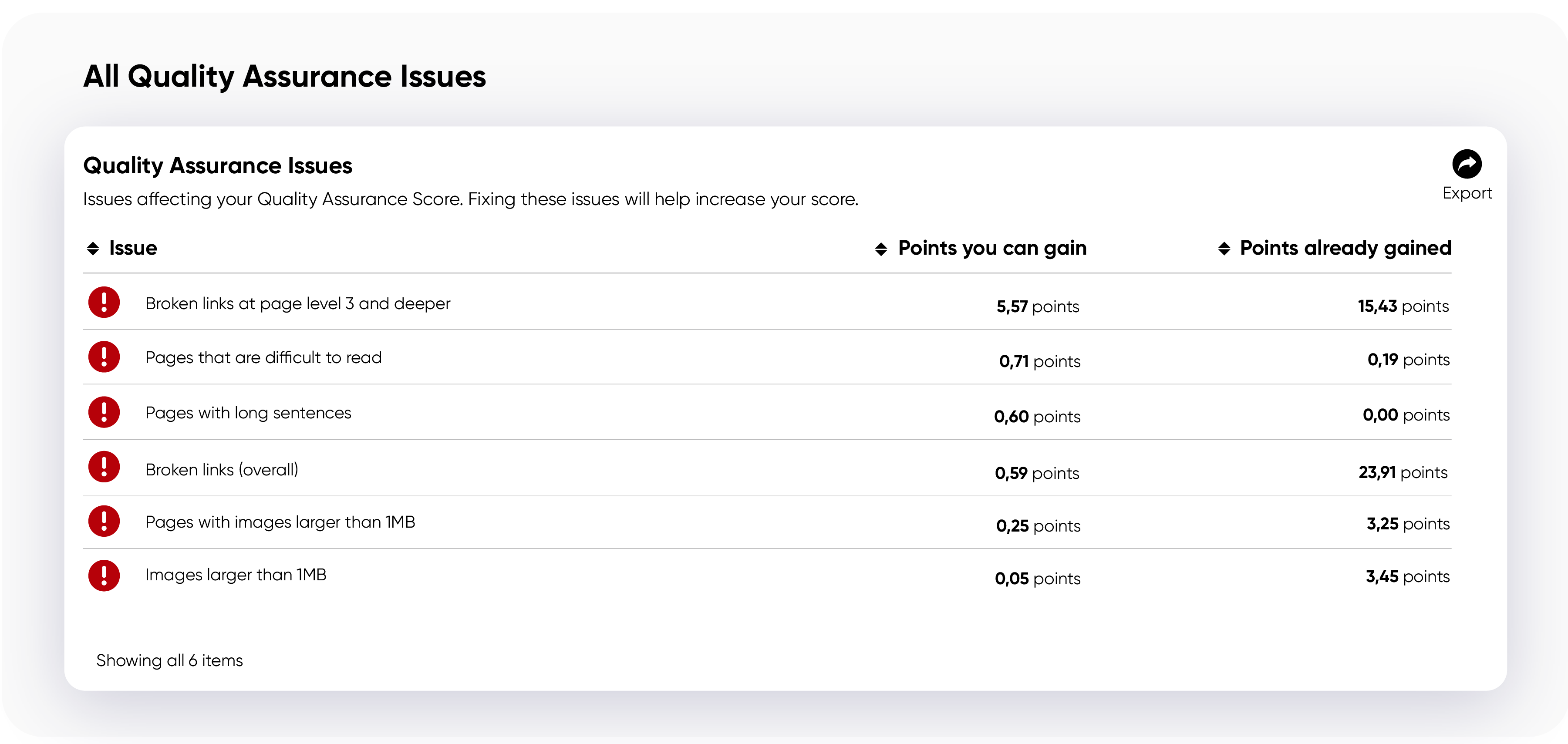
The web development team has set up a similar process, except they check more frequently and are responsible for the entire website. There are often issues that go undetected to the naked eye because they’re only apparent to visitors using screen readers. 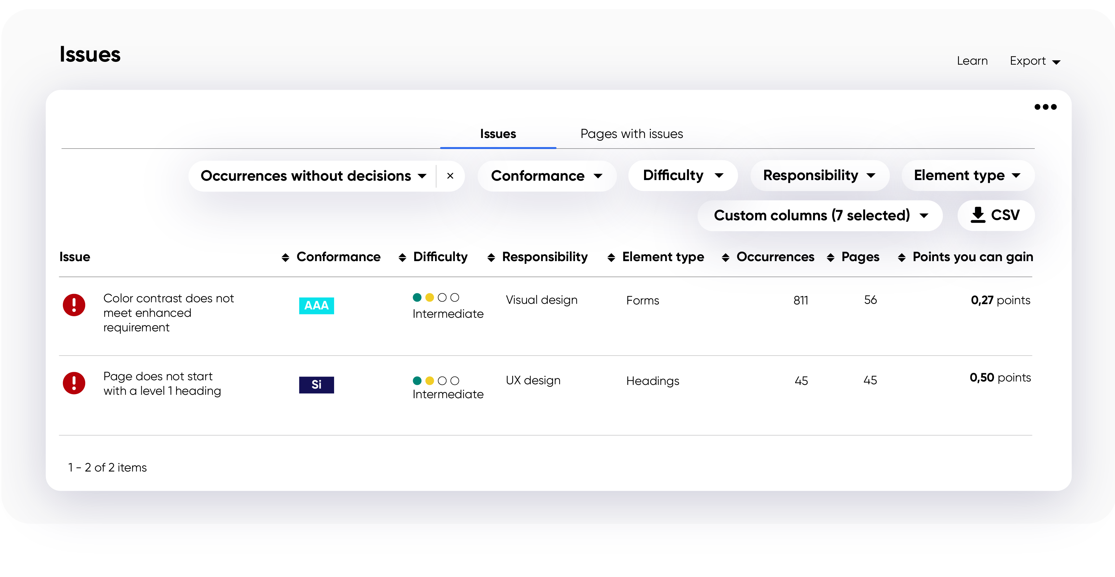
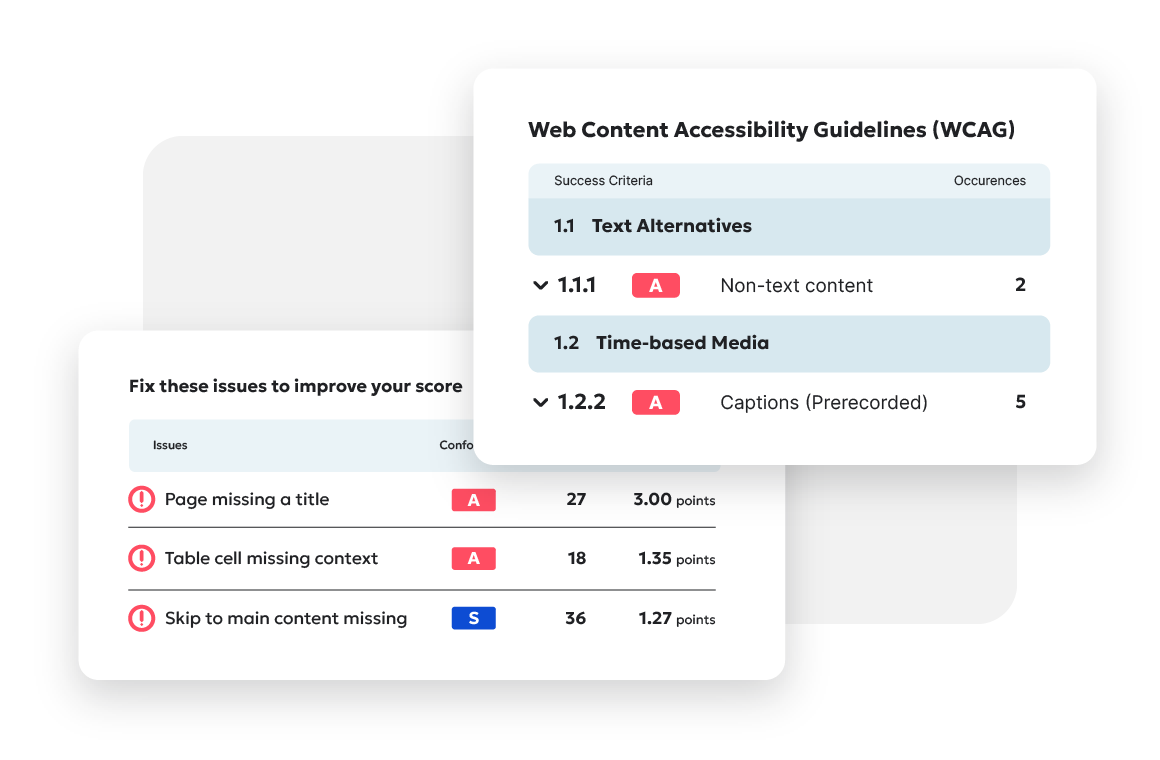
One specific issue the Siteimprove platform discovered was "Skip to main content link is missing". By adding this feature, screen readers don't have to hear the whole menu section on every page, improving overall accessibility.
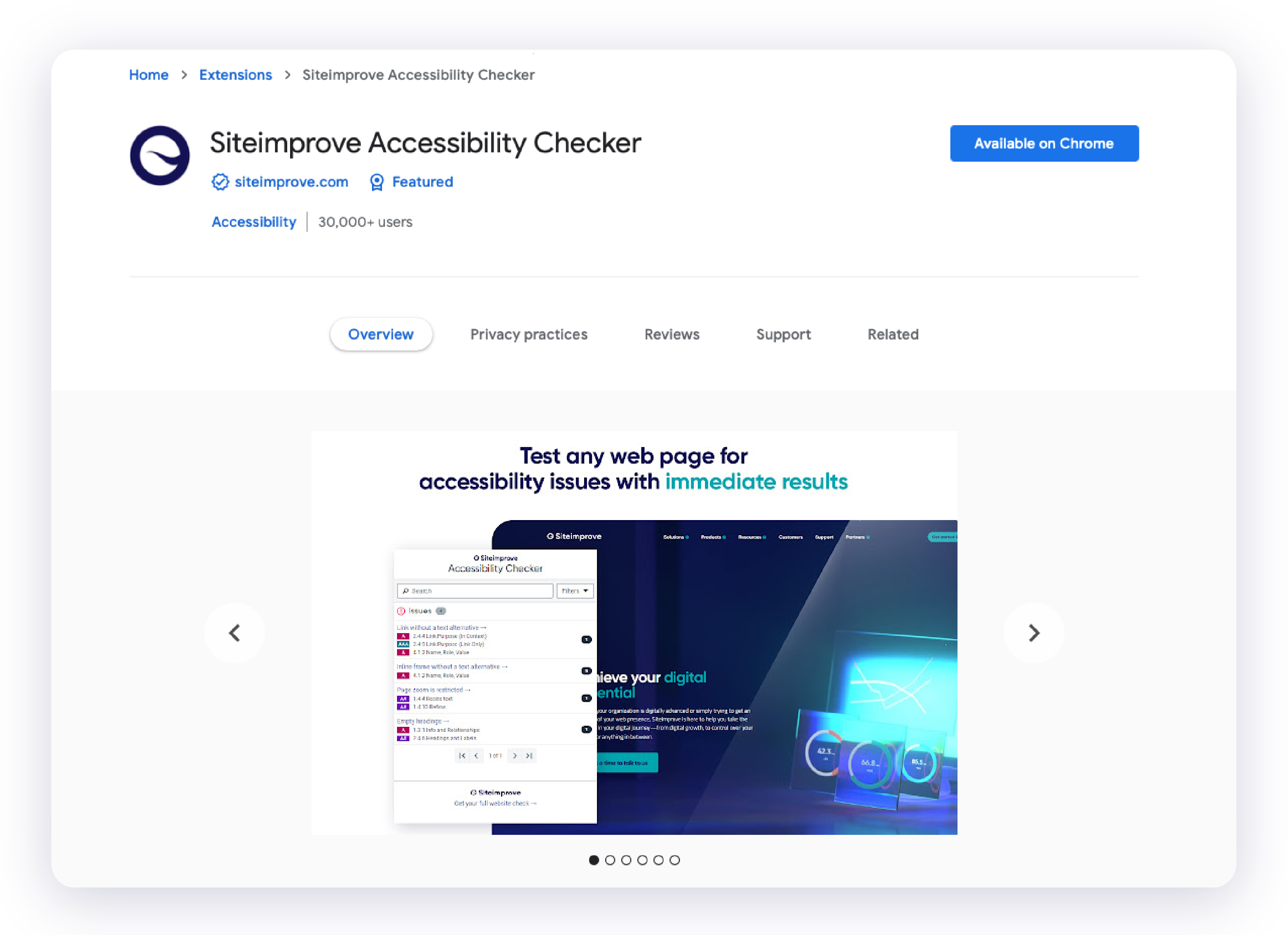
Psst... pro tip from our Senior Web Developer: In addition to our platform, we also use our Chrome extension to quickly spot issues or areas of concern on a single page. It’s a great way to resolve issues even faster!
No need to reinvent the accessibility wheel
One of the simplest ways to make sure all our new content is accessible is by ensuring the foundation we’re building on is an inclusive one.
For our content team, that means using our knowledge and our tools to check that our content is not only on-brand, error-free, and SEO-optimized before it’s ever put live, but also having certainty that the content is as accessible as possible. Siteimprove Prepublish helps us pull this off, giving us both the insight to know if our content is accessible and the confidence to press publish.
We’ve also built policies using the Siteimprove platform that help us uphold our accessibility standard. As an example, we’ve created policies for ableist terms, such as “wheelchair-bound”, suggesting that a wheelchair holds someone back, rather than serves as a vehicle and a tool. Even if someone creating content is unaware of ableist language, this policy both serves as an educational resource and peace of mind that potentially offensive terms will be spotted immediately.
Our web development team has implemented their own form of quality assurance. Every new module created in our CMS, Optimizely, is made fully accessible. The team always make sure that the HTML is structured accurately, adding correct roles and ARIA attributes to components that don't follow normal HTML standards. That way, no matter who builds a page, the only building blocks available are guaranteed to be accessible.
Houston, we have an accessibility problem
If we’ve learned anything, it’s that it comes down to our community to hold us accountable. We encourage feedback, and we aren't afraid to call each other out.
One way we tap into our community is through Slack, where we’ve created a channel for employees to share the latest articles and discussions on inclusion and diversity.
When we’re in doubt about something, we ask our accessibility experts. One issue we commonly face is staying accessible when we post on social media. We have no control over the accessibility of these platforms, so we have to work together to figure out the best sustainable solution.
For us, that meant going to our experts to discuss our best options and agree on a process. With LinkedIn, for example, when we share a video, we agreed to link to a downloadable descriptive transcript. To put that link in the post, however, would interfere with our marketing message. So we agreed to include the link in the comments.
The more we communicate and ask when we don’t know, the closer we get to a better digital experience for everyone.
Making inclusivity less... exclusive
Accessibility can be daunting, but it doesn’t need to be. There are small steps you can take to make your digital experience a more inclusive one. I’d still consider myself at the beginning of my accessibility journey, but I know that I’ve got the tools and support I need to keep learning and getting better.
As a writer, focusing on accessibility sometimes means putting cleverness aside to let clarity reign.
But the trade-off means everything. Because, in the end, it's what's best for every user—and the future of the internet.
Wondering how your site accessibility stacks up? Use our free website checker to find out.
Ready to create more accessible and inclusive web content?
Siteimprove Accessibility can help you create an inclusive digital presence for all.
Request a demo