Marketers in Progress: How we create effective display ads
- By Callum Howkins - Jun 30, 2023 Marketers in Progress Ads Web Analytics
You’re probably going to be sick of the word ‘ad’ by the end of this blog post. But stick with me.
So, ads. Depending on who you ask, they’re either the easiest or hardest part of a content marketer’s job. Lots of us got into this business to flex our creative muscles and try out fun ways to grab people’s attention. But if inspiration isn’t striking, it can mean many tedious hours spent writing and re-writing a single snippet just to get the flow right. Or seriously overthinking it as you try to find the perfect pun that’s cheeky enough to raise a smirk, but not going to get you banned from LinkedIn.
After polishing off our conversion paths (check out our previous Marketers in Progress blog post if you haven’t already), our next step was to draw more users onto our site in the first place. That’s where the ads came in. With an arsenal of punchy short-form content at our disposal, we could start stirring up some demand and directing the right people to the right places across our content experiences.
As we tackled this pretty sizable display ad project, we thought it’d be helpful to log the progress in this segment of Marketers in Progress. We’re breaking things down step by step so you can follow along at home.
What makes a good ad? How did we decide which ads were hits, and which ones were duds? And how could we use data (and our Siteimprove tools) to take out the guesswork and quantify performance? Let’s dive in and take a look.
The anatomy of a great ad
Display ads are probably as close to traditional print ads as you’ll find in today’s digital marketing landscape. They’re the small, often square, images that sit on the sidebar of websites (in our case, on LinkedIn). Kind of like virtual newspaper ads. As far as the content goes, they’re pretty much a blank canvas. Other than the handful of size requirements, the only limit is your own creativity.
Unlike a static ad or sponsored post, there’s no body or post copy to work with here. It’s already best practice to keep any ads you write short and sweet, but display ads take this ethos to the next level. You only have a couple of square inches of screen real estate on your average desktop screen, which, in practical terms, means you’ve got 5 or 6 words to get your message across. Every word counts.
Building the best ads we can (fifty times over)
For each persona, we decided we were going to need 50 variations. Yes, that’s right: 50 different combinations of ad copy and CTAs for each of our 3 key personas (so 150 ads in total).
Why so many? It meant we had a wide range of product focuses, CTA destinations, and aligned with different problems we'd identified across our audience (which was going to be critical for the testing stage of the project).
Good ad copy identifies a problem and provides a solution. It tells you exactly what you can do about it, preferably with a clear CTA that tells your reader where they’re going to go. I know that most of this won’t be new to anyone (it’s Advertising 101, after all) but it’s always worth reiterating. Here are a few of our top tips for nailing the creative part of your ad project:
Visual consistency:
The visual component of your ad is the first thing that your prospects will notice, not the copy. It’s critical to nail down an eye-catching, consistent design template you can drop the copy variations into, and make sure it’s appealing enough not to put anyone off before they’ve had a chance to read the words!
Strong messaging:
While a bit of lightheartedness can help your ad stand out, you still need to be clear about what it is you’re offering. Be upfront and direct: what can this product do, and who is it for? LinkedIn’s targeting features will be doing a lot of the heavy lifting (more on this in a second) but the core of the ad still needs to be compelling.
Value proposition:
Even if they do take the time to click your ad, what’s in it for them? Every good B2B ad has a user benefit at its core. How will it make your audience’s job easier? How can they take your product benefit and turn it into a good stat to put into the quarterly report? How can your success become their success too?
Now we’ve got some baseline creative to work with. But we’re not quite done yet.
A clever idea and some striking visuals might hold up on their own, but when placed alongside a thousand others, even great creative work can start to lose its edge. To create an exceptional ad, you need to know your audience inside and out and find the key points that are really going to make them notice.
It’s time to start thinking smarter and using data.
There’s no ‘one size fits all’ ad: just the right ads for the right people
Good display ads don’t (and shouldn’t) appeal to everyone. If you really want to convert, it needs to be a focused effort. After all, you’ve only got a few words to play with, you’re never going to craft something that’s going to pique everyone’s interest.
Instead, you need to think about the person you’re targeting on a granular level. What’s their role? What are they looking for? How does your product solve their challenges? How can I spell out their problem (and point them towards the solution) in 5 words or less?
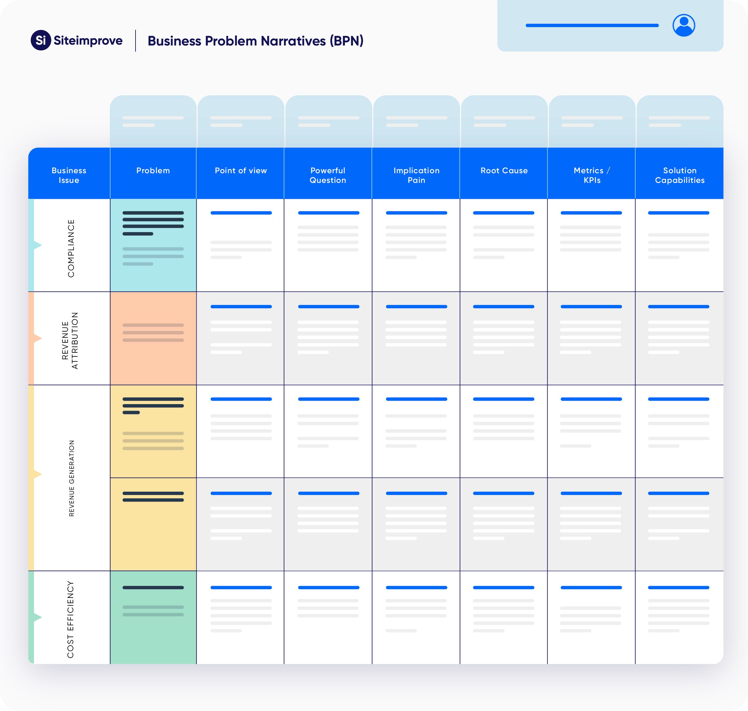
In our case, we related everything back to our detailed personas. We’d already identified their key drivers and challenges, and built unique business-problem narratives around how Siteimprove’s solutions could help each targeted persona.

We needed to use this data to make sure that each ad was solving a specific problem. This is where our demand gen team stepped in. They took the batch of ads we’d produced and launched 2 or 3 at a time, with LinkedIn’s targeting options allowing them to home in on specific job titles, experience ranges, and industries. Perfect for getting the right ads in front of the right people.
Siteimprove tools helped us refine our approach
It’s an iterative process–not instant gratification.
If our first ads performed beyond our wildest expectations, then we wouldn’t complain. But that’s an ideal situation. In the real world, it’s rare that your first ad is the most effective. And even if it is, you still want to benchmark it against other options.
The only real way to produce effective ad campaigns is to test how they perform in the field. And that means staying the course and practicing patience.
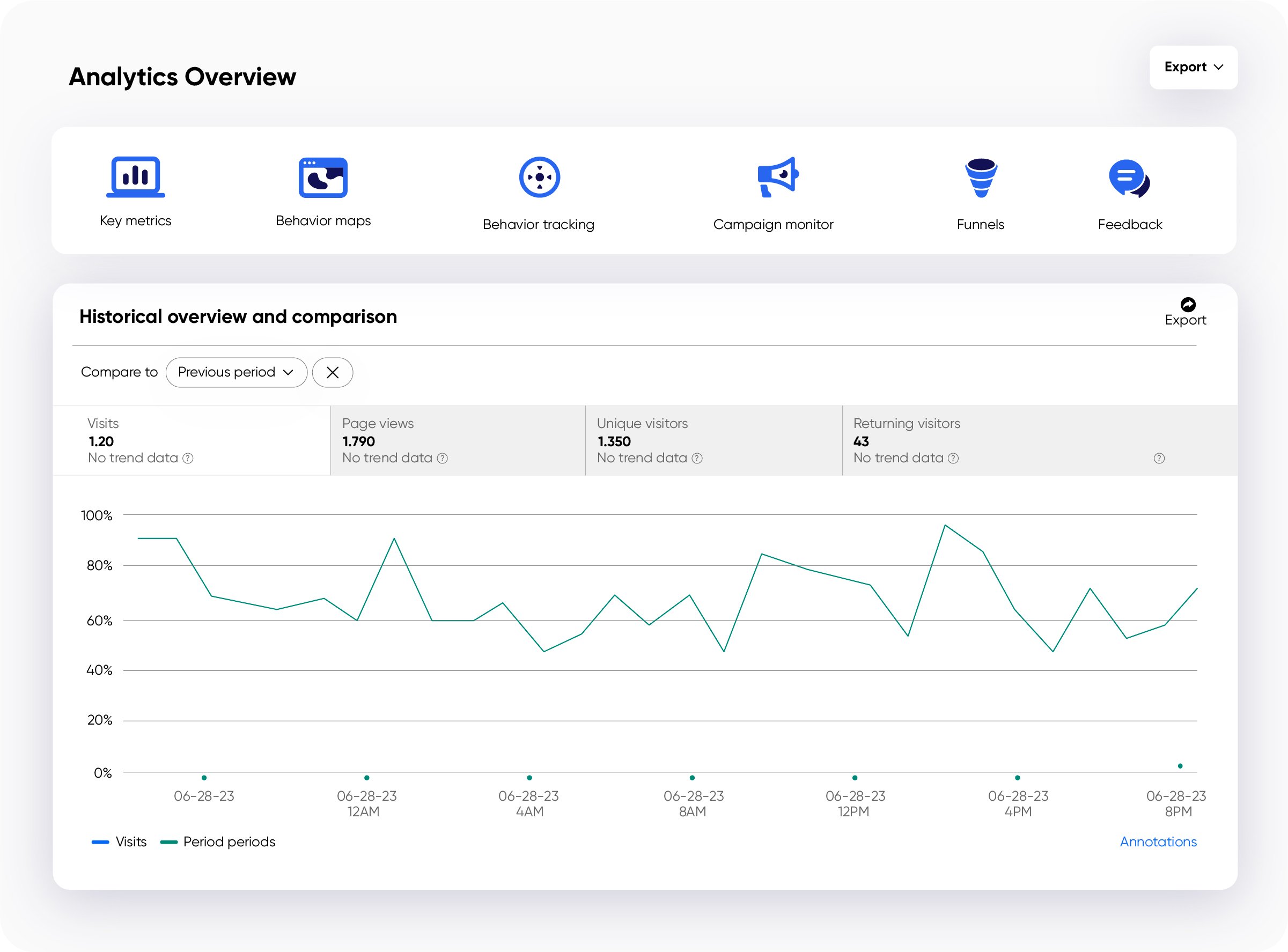
With Siteimprove Analytics, we were able to create a new project specifically to follow the traffic coming from these ads. By assigning each link a UTM (that’s Urchin Tracking Module – a unique identifier at the end of the ad’s link that helps us attribute every click to a specific ad), we could compare the performance between each ad and see how many people are engaged enough to click through.
Siteimprove Analytics helped with the most important part: setting up the experiment and choosing the right control variables. We wanted to measure what message resonated with each individual audience – and that needs good, reliable parameters to measure. We’re not changing the audience, we’re not changing the targeting – we’re just swapping out the creative after a set period of time.
So there’s our basic experiment: the only thing that’s changing is the ad itself, so that any performance gains or losses can be attributed to the creative.

By linking up the UTM parameters in the Siteimprove Analytics interface, we can see where the users arrived and what actions they took. Did they visit other pages? Did they bounce? Was the ad drawing in the right people to the right place? We can find out if the ad itself was good, but the content we linked them to didn’t resonate.
There you have it: quantified creativity
While this isn’t perfect, this system lets us put our subjectivity to one side and start thinking more about data. Once we have the data for every ad, we can start quantifying performance metrics behind the creative elements. Do shorter headlines work better? What kind of CTA resonates with each persona? Who likes stats and numbers, and who prefers more emotive statements?
It’s all about sticking to the plan and seeing it through to the end. After we’ve run through all the ads, the winner (or winners) will go back to the content stage, where we can tweak them based on the data we collected. The key to successful ads is continually refining the messaging until we get the perfect blend of creativity and performance.
With Siteimprove Analytics at our fingertips, it’s easy to bring data into our workflow and start getting instant feedback on how our content is performing. Check back in a few weeks and see the results!

Ready to make the most out of your Web Analytics?
Siteimprove Analytics is an all-in-one Web Analytics solution
Schedule a demo