Google ads: How to build landing pages that get results
- By Siteimprove - Aug 06, 2019 Ads
When you started running Google Ads, what goals did you set? More than likely, you wanted to bring in more leads, drive awareness, or simply increase engagement on your website. But setting up ads to drive traffic to your website doesn’t always translate to more conversions. A successful ads strategy requires constant monitoring and optimization to keep conversions coming in.
One of the main factors in driving those conversions is creating successful landing pages. These pages should be specifically designed—and constantly optimized—to accomplish your goals. With the right practices in place, you could even look forward to higher return on ad spend (ROAS). In this post, we’ll share some landing page best practices so you can start optimizing for the leads you want.
The Technical Stuff
First things first, let’s talk tech. What has to happen on the back end to make your landing pages effective?
Fix Conversion Roadblocks
As a user, there’s no worse experience than clicking on a link that should provide what you’re looking for, only to be met with irrelevant content or even an error page. Conduct regular checks for conversion blockers from broken links to missing alt text and more. Removing those roadblocks will improve user experience and, hopefully, lead to more conversions.
Make It Mobile
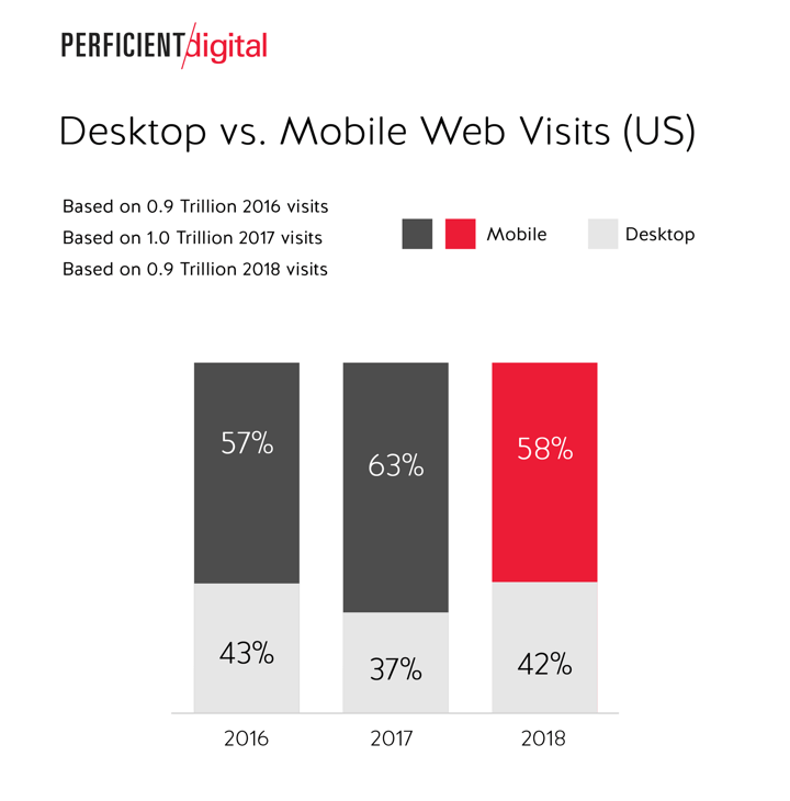
Searches on mobile devices have now surpassed searches on desktop computers and, as a result, Google has switched over to mobile-first indexing. Make sure your landing pages are mobile responsive and that content doesn’t distort or become far too long when read on a mobile device. Additionally, don’t forget forms! Keep things short, sweet, and easy for your visitors to fill out from the comfort of their smart phone screen. Otherwise, you risk leaving a huge portion of prospective conversions on the table.

Measure, Change, Repeat
Possibly the most important thing you can do for your ads is to continuously test, change things up, and figure out exactly what resonates with your target audience. In order to reach your goals and maximize your return on ad spend, testing and measurement is key. Use a tool that helps you stay organized and can alert you to the improvement opportunities that have the highest return. We may be biased, but Siteimprove Ads’ landing page tool is a great place to:
- Identify conversion blockers
- Understand what to fix first
- Watch your progress over time
The Design
Everyone loves a beautiful landing page. So how do you design a landing page that stands out and gets results?
Design for Your Goals
Your landing page is where people end up when they click through your ads, so the entire page should be designed to accomplish your ultimate goal. If that’s more conversions, make sure any forms or CTAs are prominent, attractive, and easy to use. You may even want to consider removing other navigation options to make sure your visitors have the highest possible chance of converting.
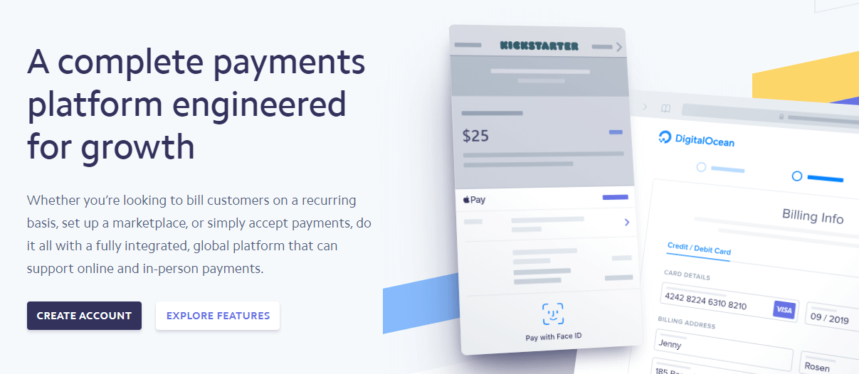
This landing page from Stripe is a great example. It’s relatively simple, giving just enough information to spark interest and providing two very clear options for visitors to take: “Create Account” for those ready to get started and “Explore Features” for those who want a little more information before jumping in.

Craft a Great User Experience
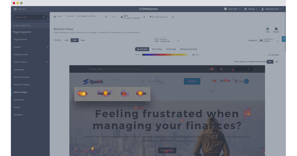
Once you know which on-page elements you need to accomplish your goals, you should also take a look at how all those pieces function together. If your landing page is clunky to use, slow to load, or unrelated to the ad it’s attached to, you won’t get results. Try behavior tracking to understand how people act on your landing pages and make strategic changes to make it easier for visitors to convert.
This example from Siteimprove’s Heat Map feature shows where page visitors spend their time. On this page, it might be useful to put the main CTA higher on the page and remove some of the menu options that seem to distract visitors from the main CTA.

The Copy
A great design goes a long way, but words matter too. How do you make sure your landing page copy gets your message across to your visitors?
Include Your Chosen Keywords
You’ve spent some time compiling a list of keywords that you think will impact your Ads results – don’t let that work go to waste! Make sure your landing pages include those keywords so your visitors (and Google) know they’re in the right place for answers to their search queries. In fact, a great place to utilize your keywords would be in the H1 headers since Google places a little more weight on that area of the page. That said, you should also avoid keyword stuffing. Include relevant keywords where they feel natural and always write copy with your visitors, rather than an algorithm, in mind.
Create Relevant, High Quality, and Unique Content
Above all, the content on your page should deliver on the promise in your ad and provide the information your searcher is looking for. This may seem like a no-brainer, but you’d be surprised how many generic or unhelpful landing pages you’d spot out in the wild. Make sure all content is free of mistakes and misspellings, so users get the experience they expect. If you direct visitors to a landing page from your website, make sure it’s free of duplicate content. Otherwise, you could be subject to penalties that negatively impact your SEO and paid search efforts.
Once the design, copy, and technical aspects of your landing pages are all in line, you’re well on your way to hitting your conversion goals. To learn more about how Siteimprove can help you optimize landing pages, maximize budget, and improve your Google Quality Score, take a look at the latest addition to our platform: Siteimprove Ads.

