Digital inclusion needs to be part of the process each step of the way
- By Conny á Reynatrøð - Jun 24, 2021 Web Accessibility
“The power of the web is in its universality. Access by everyone regardless of disability is an essential aspect.”
Tim Berners-Lee, W3C director and inventor of the www
When digital inclusion is the guiding principle for any of your business’ design and development processes, your website, digital products, and services can be used by everyone - regardless of their abilities.
Setting out to make your digital properties accessible, overlay tools are one possible solution you’ll likely encounter along the way. While they’re marketed as one-click fix promising to instantly repair what’s not accessible on your website (all at a fraction of the cost of other accessibility solutions), they’re fairly limited in scope and fail to offer a full WCAG compliance solution.
Design before code
The reality is different. The only way to improve digital accessibility is to actually do the work required to become accessible, and that will not happen overnight. A quality inclusive web experience requires just as much investment as any other outward-facing area of a business.
Digital inclusion needs be a part of the process every step of the way - from planning and prototyping to developing and testing. Moving your accessibility efforts as far ‘left’ as possible in the design and testing process will allow you to not only stop creating barriers for people with disabilities but benefit all users in the long term.
We sat down with our Siteimprove accessibility experts Jennifer Chadwick and Tobias Christian Jensen to learn more about what shifting left means within accessibility design, why it is important, and what you can do to make shifting left a success for your business.


What does ‘shifting left’ mean within accessibility?
Tobias: Someone once said that fixing accessibility retroactively is like adding plumbing to a house when it has already been built; there really are no gains with this approach. Instead, accessibility should be a part of the process every step of the way.
Jennifer: ‘Shifting left’ means moving your efforts around designing and testing for accessibility issues as far left (meaning as far back and as early as possible) as you can in your team’s digital workflow or process. This implies that everyone – from the UX and graphic designers creating the page layout for the look and feel of a website; to the content writers creating copy for the images and interactions on a page; to the developers building the experience based on these specifications – is working inclusively, considering the needs and user preferences of people with disabilities as early in the process as possible.
What are the benefits of ‘shifting left’? Why do we see this trend in the market?
Tobias: The result of ‘shifting left’ is that fewer resources are spent on balance (time, money, manpower), and the end-product will not feel like someone attached extra features to it using duct tape. In fact, the user experience will typically be simplified and give a more seamless impression, which goes well in hand with the trend of minimalistic design that we often see today.
Jennifer: Without shifting left, we will continue to create barriers for people with disabilities. We need to stop developing inaccessible designs, brand colors, code, and content without testing and catching issues with these elements. By reviewing, testing, and making sure your designs meet the functional needs of people with vision, auditory, physical, cognitive, and speech disabilities, you can spot these barriers early on and change things to prevent them.
If you don’t put some effort into accessibility in the beginning, a website, app or document could be built inaccessibly, and then it’s much harder (and incurs more cost) to retrofit accessibility into it. I think we’re seeing the trend towards adopting the practice of “inclusive design” from an early stage because we become more and more aware of the benefit of having accessibility built into our digital properties from the beginning (a benefit to all users) - it’s a significant reduction of cost, time, and energy to react when a user has a poor or inaccessible experience and incites a complaint or lawsuit.
Another benefit of inclusive design: As you assess your current designs for barriers, you learn to remove them and can then share that knowledge with other teams in your organization as well. A simple approach is to create templates for websites and documents you know are accessible and re-use these to ensure a consistent and inclusive experience.
How do you shift left? Can you share examples from your work?
Tobias: We don’t want to just put more work on the shoulders of our designers, developers, and testers who already have many things on their plates. Therefore, we need to remove as many barriers as we can from our production teams. At Siteimprove we have done this by working accessibility specifications into our style guide that all new designs are based on, by building a library of reusable components with strict accessibility requirements that our developers can use, and by using Siteimprove’s automated accessibility checks to find common errors. This greatly decreased what is required of the individual employee and frees up resources to tweak the final experience.
- Style guide: We put whatever will help our designers into our style guide. This way, we can ensure font sizes that are legible, unambiguous wording, and a comfortable reading level, and especially colors that have already been paired up for nice contrasts.
- Design system: The best thing that has happened for our own accessibility has been the recent development of our own design system. Before this project, we often re-invented existing components which eventually led to having 24 different tooltip components to choose from, none of which were optimized for accessibility. Constantly spitting out new components can also really keep an accessibility expert busy with testing and doing nothing else. So, with a design system or component library we simply can develop a tooltip, or a dropdown, or a chart component once, optimize it for accessibility, and then designers and developers can pick it up and re-use it anywhere. With this in place, we’ve improved our own accessibility to a degree that was not previously possible. As an added benefit, whenever we get a new style guide or want to make small changes, they can be rolled out easily everywhere.
- Automation: There are also many things that we want to take off the shoulders of our designers and developers; there’s no need for our own people to look for issues manually that can be found automatically (up to 40% of all issues). By using our own accessibility checks, our developers simply cannot add new features to the platform if they don’t pass the tests.
What are some important elements that contribute to successfully ‘shifting left’?
Tobias: We have identified 3 crucial methods for succeeding with shifting left:
- Carrots over sticks: We strive to create a positive learning environment for all who want to improve their skills within accessibility. This means focusing on encouragement and reward, which we do with a monthly accessibility award for special team efforts. As an accessibility expert, being approachable is key. We want designers and developers to want to come to us with questions. Accessibility can be a big and complex field where experts are still learning new things every day even after 15 years in the business - and since designers and developers are rarely even being taught accessibility in school, we cannot risk demotivating them when they want to learn. That is why we always try to encourage them, praise their efforts, and sit down with them showing them the hows and whys.
- Buy-in from the top: Nothing helps more than top management communicating that accessibility is priority. Most of us care about it and want to get it right, but with many competing priorities coming from above, it often ends up being pushed in the background. It’s difficult to shift left without putting some effort behind it.
- User testing: We must test with real users with a variety of abilities. We don’t want to avoid the confirmation bias that how we use an application also applies to others, so we need input from real people to confirm our assumptions of what makes sense for them. We try to do that by consulting existing customers and with the help of our own manual accessibility testers.
Want to ‘shift left’ but still not sure where to start?
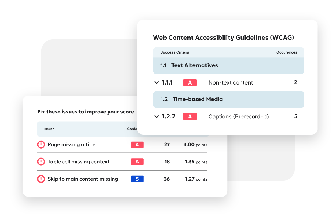
If digital accessibility still sounds overwhelming to you, then a good place to start is by getting an overview of where your site stands. Use our free website accessibility checker to see where you’re doing well and where there’s room for improvement.

Ready to create more accessible and inclusive web content?
Siteimprove Accessibility can help you create an inclusive digital presence for all.
Request a demo